User Interface Considerations for Learning #Games
In a learning game, the user interface needs to do three things for learning games.

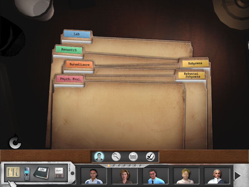
First it needs to establish the context/environment in which the game takes place. Is it an office? A warehouse, a far away planet? The interface should provide the feeling of immersion of the learner into the environment of the game. This is, of course, done with the artwork but should also be a consideration in button and menu design as well.
Second, user interfaces need to provide feedback to the learner. Are they doing the right thing? Did they choose the right option? This can be artificial feedback like a health meter or a message on the screen or it can be more authentic like the reaction of a non-player characters.
Third, the user interface needs to provide the learner with control. When a learner presses a key, they need to see immediate results of their actions. They need the sense of autonomy and control that comes from knowing they are controlling a character or an action. Controls (buttons, “hot” areas, etc.) need to provide feedback to the players and obvious reaction to a learner action.

So while these interface options are important, it is equally important to consider what the interface should not do.
Avoid Confusion. In a learning game, unlike World of Warcraft, the learner doesn’t have hours and hours and hours to dedicate to figuring out the interface, you want to be as clear and specific as possible. The learner should not need to search for items he or she needs in the gamespace and, if you are using an inventory system, keep it simple and straightforward.
Reduce Amount of Buttons, Menus, etc.
Teams sometimes want to mimic reality too closely or put in too many options which eventually confuse the player. Keep what the player needs to press to a minim. Keep the control scheme simple. One way to do this is to be consistent with the functionality of a key stroke. Consistency can be helpful to someone playing a learning game.
Keeping these ideas in mind will help you to develop an interface that works for the learner and doesn’t cause too much confusion.
Posted in: Games
Leave a Comment (0) ↓