Visual Learning and Information Display: Professor’s Memory Lapse
Last night I was teaching away and I was talking about the visual display of information, I could clearly, “in my mind’s eye” see what I was talking about but I couldn’t remember the web site URL to which I was referring. I kept thinking that it would “come to me” but alas, it never did. (talk about a senior moment.)
Luckily, I try to keep track of everything by writing it down either in my blog or in my books…an extension of my memory. So I knew I had written about the site in my latest book. I went home and looked it up….the site is liveplasma. This is an excellent site for understanding how it is possible to design visual software that is easy to use and understand.
Here is what I say about it in the book (my memory life saver.)
Computer interfaces are historically difficulty to use. The “Graphical User Interface” everyone talks about isn’t graphical at all. Liveplasma is an exception.
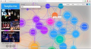
This software is a musical data base of popular singers and bands that has an intuitive, easy to use interface. It is completely visual. Three simple elements provide the user interface; color, size and proximity.
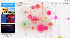
Bands or singers are grouped according to interest, style and other criteria which indicate how much someone would enjoy one band as compared to others. Each band appears as a colored sphere shown on a map of linked spheres. Color indicates how much a band influenced other bands or how related one band is to another.
Bands shown in shades of the same color indicate a relationship between those bands.
For example, the Beatles are in one shade of pink and, and related artists or groups are shown in different colors. Julian Lennon is shown in a Orange; a related color but not the same shade. The size of the sphere indicates the popularity of the band. The sphere for the Beatles is extremely large compared to other groups like the Traveling Wilburys or individual singers.
Another level of information is contained in the proximity of one sphere to another. The closer one band or singer is to your favorite band the greater the chances of you liking that other band; the farther away, the less similar the musical styles. Britney Spears is shown in close proximity to Christina Aguilera and Jessica Simpson but is farther away from Sheryl Crow and Alanis Morissette.
This type of interface is easy to learn, contains critical information available at a glance and can be applied to a variety of content types. It could be used to look at sales data, production information or organizational expenses. Once the principles of the interface are learned, they can be applied to a variety of content virtually eliminating the need for training on how to use the software.
So, I was glad that my book served as an extension of my memory.
My blog serves the same purpose. It is my modern day Memex.(should our training materials help learners in the same way…provide a memory extension a way to look up information at a moments notice.)
If you are interested in visual displays of information, check out these additional sites and add your favorites in the comments.
- Periodic Table of Visualization Methods
- VizThink Blog
- Inspiration Software
- Big Data Visualization: Review of the 20 Best Tools
__
Catalog of Recommended Books, Games and Gadgets
Recommended Games and Gadgets
Recommended Books
Content Guide
Posted in: Design
Leave a Comment (3) ↓


Stephen, Thanks for the comment, not sure I buy the “imagine with million entries” arguement. Many data bases only have a few thousand entires (like ERP systems or even CRM systems) and they still employee lousy interfaces. Waiting for the perfect scalable interface may take forever. I think carefully constructed search criteria can help make a database like this useful without making it too busy. Of course a “search for all” with be like a Jackson Pollack painting given this interface.
Hi Karl,
I agree with Stephen, however think some of the work done by Ben Shneiderman and others at U MD addresses these issues about display. I’m curious what you think of interfaces such as kayak.com for filtering information in place.
Finally, given your memory lapse and ways of coping with it, what do you think of the notion of Social Sigma – http://lisaneal.wordpress.com/2008/02/07/would-agatha-christie-write-a-blog-if-she-were-still-alive/
This type of interface works fine with a small body of well-known information, like the top 20 rock stars.
It works poorly with large bodies of much more densely connected sets, such as the tens of thousands of published artists.
For any interface, my recommendation is: imagine it with a million entries. Would it still work? If not, try another interface.